I designed an interior design app for spatial computing/extended reality
In the previous article, I carried out some user research to understand opportunities when it comes to using genAI and extended reality(XR) for interior design. About 1 month later, I did a design exploration to capitalise on those opportunities. I even prototyped the key interactions with Bezi, a spatial design tool. Let’s dive into it.
Recap of user stories
To recap these are the 2 user stories previously established:

To manage scope, I primarily focused on the 1st user story but managed to partially address the 2nd one too.
The solution
I called the solution Envision. It is a desktop and spatial computing app for mixed reality headsets like the Apple Vision Pro and Meta Quest 3. It allows interior designers to import their models from their favourite apps to view them and experiment with ideas in extended reality. It is specifically focused on testing ideas and going back and forth with clients.
Here’s a sizzle reel of its features:
Entry point: desktop import
The entry point is a desktop app or progressive web app where the model can be imported. After importing the models we would allow the interior designer to indicate teleportation points and decide what elements of the model is editable. Afterwards these models would be ready for the headset.
Feature 1: tabletop view and applying themes
When you first put on the headset, you are greeted with a UI panel allowing you to choose a model you have imported on desktop. Once you choose one, it’ll appear as a tabletop sized model below you.
We knew from user research that we should not be applying the theme/skin immediately, thus the model can be viewed as a simple white model first. You can store multiple themes and apply them easily by pressing the toggle (which you can turn off anytime). How each theme is applied can be done on desktop. However, this flow is omitted to reduce scope for this project.
What if you want the client to visualise themselves in the model itself? Expanding the panel shows you the teleport points you set previously. Tapping on them will bring you right in. Of course, a screen quickly pops up explaining how to bring up quick actions for the hand UI. (more on that later)
Feature 2: table top view and moving objects around
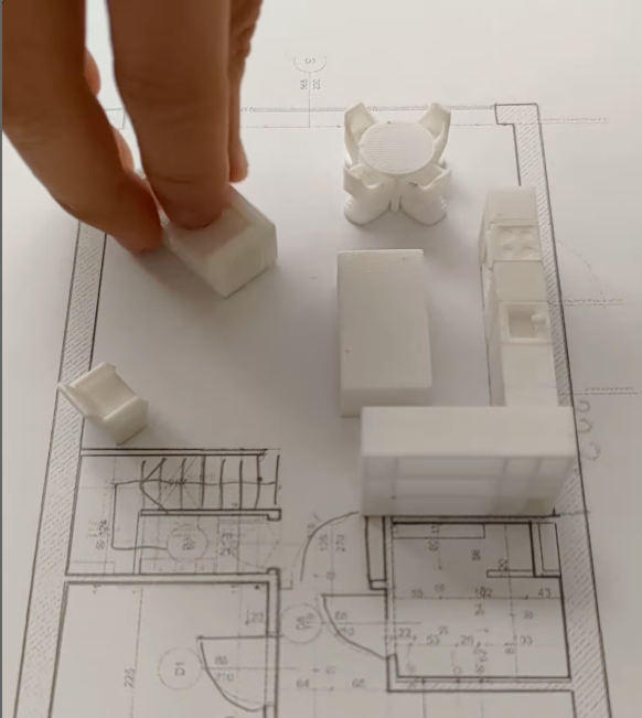
For this I was inspired by the Instagram account DearModern. He would use these simple tabletop models of furniture and move them around on top of a paper floor plan. It was a simple, yet effective way to showcase his idea.
The tabletop model aims to be as simple as that. You would pinch to grab them with your hands to move and rotate them accordingly.
Feature 3: Immersion within the model and hand UI

So what happens after you teleport into the model itself? To pull up some quick actions, the user can flick their wrist up as if they were looking at a watch on their wrist. These quick actions can be directly touched to trigger them, they include:
- Adjusting your height
- Teleporting to different rooms
- Leaving comments
- Exiting immersive mode
The video above is a demo for teleporting to different rooms. This feature is intentionally added as moving around within a space contributes to motion sickness. Tapping on the current position will bring a panel for you to decide which room to teleport to.
Initially, the screen transitions were on the hand UI itself but we moved away from that. This is because the hand UI requires you to turn your wrist and keep it in this position which could cause fatigue. Therefore, this hand UI is best for single tap interactions to bring up a panel in front of you instead. That way you can use Apple Vision Pro’s eye tracking to look and pinch your fingers accordingly.
There are also options to adjust your height in order to mimic your actual one. This would allow you to see if you can reach certain items like a shelf for example. Of course, you can leave a comment as well. Finally the last button lets you exit this immersive mode.
Feature 4: swapping out the models via offshoots
The last feature is swapping out and editing the furniture within the model itself. Inspired by how git has branches, I named this feature offshoots. The idea is that you can create different versions of a piece of furniture and switch between these different versions. This includes swapping it back to the original version too of course.
Within each offshoot, you can make changes to the furniture, this could include:
- Swapping out the piece of furniture for another one (like switching a sofa out for an armchair)
- Making changes to the theme (if you’re in a later part of the design stage)
- Leaving comments to that version of the furniture itself
After which you can switch it to another offshoot or back to its original version.
When swapping out models, there are 2 ways of doing it. First, you could manually choose a model that you would have in your library. You would also be able to edit the materials and colour manually as well.
But what if you or the client wants something not within your library? That’s where the second way comes in. As seen in the video above, we would first select the piece of furniture. Afterwards we would tap create offshoot and choose “Generate with AI”. Yes, you read that right, using AI to generate 3D models is possible (just look at Luma AI’s Genie). So then we would use a text prompt to generate a 3D model and replace the piece of furniture.
Why do we need such a feature? This is important as clients tend to change their mind multiple times. In fact, it is a term in the industry locally known as “flipping prata”. However by having quick experimentation, a larger sample size of the client’s likes and dislikes can be achieved. This reduces the chances of them “flipping prata” down the road.
Learnings
Optimise for Quest 2
As I was borrowing a friend’s Quest 2 as my main experimentation headset(thanks Roy!), it’s performance as well as hand tracking was limited. With something as asset heavy as a floor plan, the Quest 2 was pushed to the limit and was borderline unusable when prototyping the scene.
I found out from Bezi’s super helpful discord that the recommended polycount within a scene for Quest 2 is 50k vertices. I tried to keep within the limit and lower the resolution of any rasterised images I can as well. I even removed the textures and did the interactions with the white model too.
To make things even more bearable, I split each feature into its own file just so that there would be less to render. Wherever possible, I would screen record on my mac instead since it has more horsepower. I’m sure this would be less and less of a problem as both the software and hardware evolves though.
Don’t reinvent the wheel

Initially, I tried to create my own panels to make things more platform agnostic. However, I realised I had to reinvent the wheel, I had to think about affordances and recreate these things. I also had limited time and effort as I was doing this on the side and not as a full-time day job.

I decided to pull the trigger and use Apple Vision Pro’s design system and my panels started looking a lot more polished. It also had accounted for affordances within the design system itself.
Managing burnout
While working on this project alongside my other commitments, I dedicated a significant portion of my free time to it. The frustration heightened due to the subpar performance of Quest 2, attributed to its use of a mid-range smartphone chip from 2020. When combined with the demands of my job, I felt like I was stretched thin and burning the candle at both ends.

I was watching the tech YouTuber MKBHD and he quoted the visual above for burnout. It made so much sense. Doing creative work (or any kind of work) is like running on a treadmill. You need to find a speed that is right for you, or occasionally step off the treadmill. If you don’t, you just might end up like the robot you see in the GIF.
To ensure I don’t burn out, I would purposely take rest days, not touch this side project or do other parts of it. Sometimes, I come back and the prototype suddenly starts working because the Bezi team resolved a bug. (Kudos to the Bezi team for that!) Sometimes, the break also allows me to come back with fresher eyes and perspective. I had to remember, that it’s not a sprint but a marathon.
Conclusion
1–2 weeks before posting this, I stumbled upon a promo video from Meta about using Quest 3 for work. In it, I found out there’s an app called Arkio that exists and offers pretty similar features 😅. Although, this was a bit of a gut punch, to some extent this validates the idea and use case.
All in all, it was a great (but also tiring) learning experience. With the release of Apple Vision Pro, more and more ideas are being explored in spatial computing/extended reality. I can’t wait to see what everyone comes up with and what the future holds for this platform!
On the side, I would also like to thank my mentor Marc for advising me along the way for this side project. Thanks again Marc!

